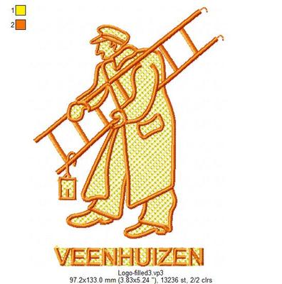
Knock Down Stitches. What do you know about them? I've heard people talk about making their own when putting a design on towels. Is it the same as embossed? What would I look for in my software to create them? I use MasterWorks II. TIA!
I've been embroidering this design on towels for years, first without the knock-down stitches, then I added them (underlay, embossing stitches, whatever you call them) in the colour of the towel. It gives a much clearer and crisper embroideryy and it keeps its shape well after washing them time and again.
I have also used them as if they were an integral part of a design; see pict 2. The actual logo was the blue only.
And, yes, I had permission to use the artwork for both of them.
1 comment
I have this facility with my software and I tried it twice. On a plain white towel it was reasonably OK but on a pink towel, I could see the stitches as the thread was not the exact pink of the towel. I will probably not use it in the future.
1 comment
If I am working on a fluffy, fuzzy item, I will sometimes digitize a layer of stitches ... kind of like embossing stitches under the design...especially if it is lettering where the fluff might cover up thinner parts of the letters...I have also used fine bridal tulle under the design that is the same color as the material...once you embroider over the tulle it pulls away very easily...this will also keep the nap down so the design is clear and the lettering sharp...
2 comments
If your goal is to prevent "pokies" from the towel poking through, I have seen two simple suggestions here, both of which work. One is the add organza in a matching color above the towel and beneath the stitches. The other is to use regular fabric as a background. Either would want an edge of stitches as in a patch or applique - just use a square or rectangle from one of your applique designs.
2 comments
Someone else just asked this question on FaceBook. I think in my software it would be called "underlay" and I would do it very densely.


