




 22595✽
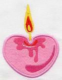
I stitched out the new design from basketcase today on a MDSF t-shirt from a few years ago. It isn't perfect because my machine decided to act up and I had to re-do part of it. I followed the colors that my machine suggested except tor the last color which I matched to the printing above. I think the colors are too bold for the light pink shirt so when I put this on our shirts for this year I will soften the shades a bit, lighter greens and paler yellows and pinks. Thanks for the design.
1 images:
[1]

Comments (10)
 109974✽
by
crafter2243
18 Apr 2016
+6✽
That is such a sweet idea and Vicky does a great job digitzing. I hope you will show the one you finally will make for this year.
 234609✽
Great job and I don't mind the bright colours Teresa. Love Chris
1 comment
me either , looks great!
 261164✽
by
basketkase
18 Apr 2016
+4✽
I am thrilled this design works out for your annually get together....isn't it funny how things happen like this.......it looks great on the pink sweatshirt...that is what I was going to put it on, but I didn't have a pink one in stock.........great stitching........
1 comment
It is perfect, right down to the pink ribbon for breast cancer. We wear pink for the girls grandmother who passed from the disease.
 360672✽
 85867✽
Lots of work! Two hoopings. Nice job! Kay
1 comment
No, only one hooping. The lettering on the top is screen printed. This was a t-shirt that I had from a previous mother-daughter weekend.. I wanted to test the design before I put it on the shirts for this year.
 10296✽
66028✽
78119✽
 3554✽
Super design, i would'nt change the colors on the t-shirt, these colors look great.
Hugs,
Gabi
Hugs,
Gabi
1 comment
Not really change them, just make them softer. They are much brighter than the picture shows them.
66948✽