

360672✽
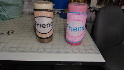
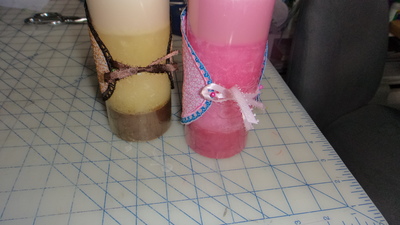
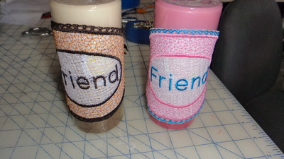
I made a couple of Quick gifts . The design was digitized by a cutie 4 me.I tried leaving the heavy tear away in to see what it would look like on the pink one??? What do you think?? Thanks 4 looking hugs Carolyn
4 images:
[1]
[2]

[3]
[4]
Comments (10)

261163✽
by
basketkase
09 Jun 2019
+6✽
I think they both look good......maybe leaving the tearaway in on the pink one helps the letters pop against the white......they will love these!
1 comment
Thanks, Vicki hugs xx

907✽
by
marietherese
09 Jun 2019
+5✽
I think the pink one looks better. The design is neater and more accurate maybe better not to remove the heavy tear away, or maybe it's the pink candle that gives that impression. Anyway very nice ! Love Marie
1 comment
I agree wanted to see others opinion!!!

145791✽
Nice Carolyn!
1 comment
Thanks Lillian hugs:):)

234573✽
I like the effect of the white being left on. Great job, love Chris
11504✽
by
crazypatchmama
10 Jun 2019
+2✽
Good job, Carolyn. Love both, another FSL!!!!Hugs, Mary
1 comment
Thanks, Mary HUGS 4u2

38558✽
18140✽
Very nice on all!
1 comment
Thanks for looking hugs
66028✽

85867✽
18542✽
I think the pink one is prettiest--you can't see your thread behind it and it seems like the stitches are more intact. Still, I am not sure if it was meant to be a FSL project or not. I still like the pink, the letters and satin stitch is more crisp.