






34246✽
all other letters were uniformed but that one........
Comments (4)

463490✽
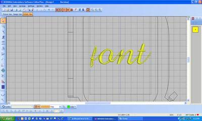
I just looked at it and I think you are right. The lower f should be a letter that goes as high and as low as possible but instead it fits into just the height of the letters that stay above the "line". like the letter b.
1 comment
THANKS, THEN i AM NOT LOOSING IT....
463490✽
Will you be sending a message to Veronika? It's a handy font to have with lower case too. It would be a shame to not be able to use the f.

158720✽
I don't think I've ever tried it, the small font f that is. I can adjust with my Artista software, but I know that everyone doesn't have that option. Please let Miss Veronika know, I'm sure she would want to check it out. Did both of you check PES only? It is definately smaller in ART.
2 comments
I only checked pes.
I sent a message...waiting for a reply back.....thanks for posting the picture....doesn't look good with all the other beautiful lettering....
463490✽