




255066✽
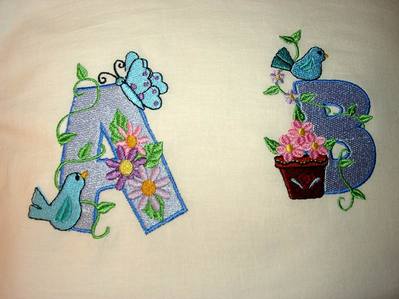
result. The A was the original size but I reduced the B until it fitted into my hoop. The stitching is a bit dense - bit I can live with that. There are a couple of places on both letters where my tension played up. I know this should probably be posted in projects but I thought it was more suitable here. I will now reduce the other letters that are too large.
Comments (4)
255066✽
These are the results as you can see the 'B' is much smaller that the 'A' due to reducing the size.

140727✽
The B is much taller (128mm)isn't it? If you wanted to use the letters together you would have to reduce them all by the same amount or they would look really strange. Its the bird sitting on the top causing the problem!
2 comments
PS Did you use the same shade of blue for both letters or is the apparent difference due to the extra density?
Interesting Sue, I did use the same blue. In the photograph I agree it looks different which I think as you say it is the density. I shall probably only use the alphas for a single letter so I do not think it will matter. Also I think the 'B' has been the longest so far.

33580✽
Looks pretty good! I was downloading the new daily freebie of vines with flowers till I found some were larger than 4x4 so I quit downloading them, I had size a couple down with Trusizer but I didn't stitch them out and just decided to dump them, sorry I did but, Oh well, it's not like I use a lot of the alphas or don't have enough.

48168✽