


140724✽
The beginnings of a quilt (I hope!)
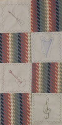
I've been fiddling with outlines of some of our musical instruments in the hopes of making a quilt. Here are the first few of the designs. I'm concerned that the print fabric is a bit bold in comparison.
1 images:
[1]
Comments (15)

31625✽
You're off to a great start. Can't wait to see the finished project.

70767✽
21593✽

89895✽
I think it looks nice and if there was a way to make the outline stitches darker or a little thicker they would be a little more dominate for you.
1 comment
The outlines are alreader quite solid but the strings have to be single stitch - and there are so many on the harp!

35675✽
"Fiddling" huh? That struck me as funny..in the South we call a certain style of violin playing "fiddling"! I like the bold fabric with the emb. blocks. Keep on going!! And be sure to put in a fiddle!
1 comment
I do have a fiddle but I haven't worked on a design with it yet as we have so many instruments.
6622✽
by
bettytaylor
27 Jan 2012
+5✽
If this is all you have done so far, maybe you could switch to black thread for the rest, it should make a difference, not too hard to take apart if needed, I use my rotary cutter to separate thread in quilts when I need to take apart. Betty
1 comment
I want to stick with the colours I've used to pick out those in the print. There isn't quite such a contrast "in the flesh" so I thnk it will be OK.

211086✽
by
shirlener88
27 Jan 2012
+4✽
Sue, it LQQKs lovely - much more in the close up - I love the coloring - you have a great eye for this sort of work - keep on stitching.
18403✽
I like the contrast of light and dark; seems to strike a very nice balance;sets the tone for the quilt..

145307✽
Love the designs, the harp in paticular.
Sue, I 'digitised' a straight line in User editors, setting a couple of extra points so I had 4 stitches and set the length to the default 8 mm. Saved it as a motif. Just start using the fill tool, choose motif in parameters, get the line, set the density to get the lines at the distance you want. It would work well for your strings. Sounds far more complicated then it is. I use it a lot.
Sue, I 'digitised' a straight line in User editors, setting a couple of extra points so I had 4 stitches and set the length to the default 8 mm. Saved it as a motif. Just start using the fill tool, choose motif in parameters, get the line, set the density to get the lines at the distance you want. It would work well for your strings. Sounds far more complicated then it is. I use it a lot.
1 comment
Thanks for the tip - I'll give it a try.
115784✽
by
asterixsew
27 Jan 2012
+4✽
Interesting work Sue, I to love the harp and the backgrud fabric. It looks like a duvet cover I had from Jessops years ago
2 comments
Should have said 'do you want a cello?'
Ha
It did actually start life as a duvet cover! Well recognised.
It did actually start life as a duvet cover! Well recognised.

20661✽
I really like the colors you've chosen to use. Keep up tthe good work and be sure to show when you've finished.

24342✽

54619✽

119791✽

173695✽
I have that same dilema with a project. I like it! Thanks for sharing! Live Laugh Download Stitch!