




24342✽
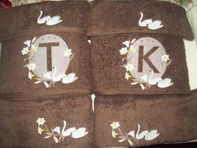
Needing some candid comments about this towel the colors, this is the hand towel for an order for embossed swan design. I have done this one many times and love it but they have chosen CREAM towels not so sure that is a good choice. will up load some others for comparison.
2 images:
[1]

[2]

Comments (21)
24342✽
this a gift from a daughter to her mum for Mothers Day...uploading another photo for comparison hope I haven't loaded twice...hugs Sally
3 comments
Brown much better for contrast. Came out beautifully!
ttt

ttt

86901✽
by
highlandermom
06 May 2012
+8✽
Beautiful design love cream but the brown set brings out the design much more.
1 comment
I agree love the brown

937✽
It is beautiful, but I would choose a pale, light green for the flower leaves and try a darker colour for the embossed part(a brown tone) maybe like your choice for the leaves. And then remember that some peoples don't like too many bright colours or big contrasts, so I think a "pale" version could be quite beautiful.
By the way I love colours - the more the better, but I can also see that sometimes "less is more".
If possibel, show them a sample and get their accept or their ideas for colour choice.
Conny
By the way I love colours - the more the better, but I can also see that sometimes "less is more".
If possibel, show them a sample and get their accept or their ideas for colour choice.
Conny
1 comment
Thank you I did think about a very pale green for the flowers will suggest that it is my DIL for her mother, I have sent her this photo before actually stitching her towels. thank you for your comment

360672✽
wELL I LOVE IT GREAT JOB HUGS
1 comment
Caroline thanks just thought they maybe to bland...hugs sally
5755✽
Cream wouldn't have been my first color choice; but I think this towel is lovely anyway.
1 comment
Thank you!

70767✽

11860✽
I like conny's idea of a pale light green for the leaves. What about more of a buttery yellow for the flowers, instead of golden yellow?
1 comment
Will look at that!

89895✽
Lovely for both of them. Swans are serene and if you visualize them in a marsh land area these would be perfectly in nature.
1 comment
Thank you for you comment I agree Swans are serene. this set is for DIL's mother and she is a lovely sweet lady, possibly doesn't like bright colors.

57675✽
I'm not sure what it would look like...but have you thought about blue flowers, green or brown leaves, and black swans? The metaphor meaning of a black swan is un unexpected event. I hope it wouldn't be misunderstood. If you used a dark charcoal grey thread with the silver grey a bit darker it would stand out on the cream towel a lot more.
1 comment
I will play around with colors as you suggest could be fun. Black Swan is the emblem of Western Australia. May suggest that. after all she does live in australia.

119791✽

15711✽
Depends whether she likes understated designs. Cream towles do seem to be popular!
1 comment
Yes cream does seem popular!

46919✽

54619✽
Ich mag es wie es ist,sehr schön
1 comment
thanks!

12667✽
Your embroidery is perfect and the towel is beautiful. But I see why you are not fully satisfied. You have done it before with a diffent colorscheme which made it stand out more and you liked it more. Nothing wrong with this one though. I for one would love it in my bathroom.
1 comment
You are right, I like contrast and this is quite tone on tone. I like it but! just needed to see what others thought. Thanks Sally

132773✽
Sally it is lovely, love the tone on tone. Hugs Yvonne
1 comment
Yvonne, thanks isn't it awful when you doubt yourself? hugs sally
174✽
I ready like them. As far as the done the cream color towel, this would look ready good in my bath, the cabinet are done with the white and cream color.
1 comment
Thanks not sure of her color bathroom that could make a big difference.

25510✽
I agree with some of the other comments. I prefer the darker towel for more contrast, but I see nothing wrong with the cream towel. You can still see all the detail. You did a very nice job too.
Hugs, Susan
Hugs, Susan
1 comment
Thanks Susan!!!

211088✽
by
shirlener88
07 May 2012
+2✽
Sally it is more of a tonal set - I like it - let us know what your DIL thinks.
1 comment
Shirlene, will let you know what she thinks. thanks. hugs Sally

743369✽
it looks very good, but I would look even better if the towl had the color a little bit darker.
19282✽
I really like the swans you did a great job!, Did you ever think about making them black?

27683✽