



140724✽
I've just started to get into the Embird Font Engine instead of EFP, but there are some features I'm not keen on. Could someone with more experience than I have, tell me how to get rid of the stitched connections between the letters? Pretty please.
Comments (4)

57675✽
I do not have it but I found this. Would it be under the Inset tab because that is where auto-trimming is located.
I do hope someone that actually KNOWS will help you soon!
I do hope someone that actually KNOWS will help you soon!
1 links:
[1]
http://www.embird.net/sw/embird/tutorial/engine/engine.htm
www.embird.net
2 comments
Thanks! Now I feel really dim for not noticing that already. I'm going for a lie down.
Please do not feel dim -- I am a computer professional! Hugs!

11929✽
Have you recovered now, Sue?
2 comments
Slightly. I've just had a soak in the big white tank.
LOL

145307✽
Hi Sue,
I like to use FontEngine in Studio. To get rid of the connection stitches remove them in your object list on the right.
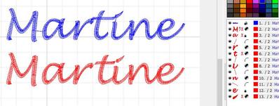
In Studio you can make so many adjustments. Here's an example.
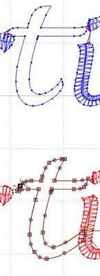
I did my name in a script font (Lucida handwriting) and was not too impressed by the result as the t overlaps both the r and the dot on the i. You can widen the gap between the letters but then nothing touches so I moved the t a bit to the right, shortened the bar, lengthened the lower right so it moves under the i a bit and moved the end point. Then I redid the stitching order so the dot on the i stitches last. I removed connections stitches where they were not wanted and added them to make sure 'tine' stitched without jumps. It looks better and also stitches out better, I think
I like to use FontEngine in Studio. To get rid of the connection stitches remove them in your object list on the right.
In Studio you can make so many adjustments. Here's an example.
I did my name in a script font (Lucida handwriting) and was not too impressed by the result as the t overlaps both the r and the dot on the i. You can widen the gap between the letters but then nothing touches so I moved the t a bit to the right, shortened the bar, lengthened the lower right so it moves under the i a bit and moved the end point. Then I redid the stitching order so the dot on the i stitches last. I removed connections stitches where they were not wanted and added them to make sure 'tine' stitched without jumps. It looks better and also stitches out better, I think
2 comments
Thanks for that, I hadn't tried using it in Studio. To be honest, I didn't know it could be done. I was frustrated by not being able to make adjustments like yours on the text I created in Editor and you are the answer to my problems - yet again!!
Glad I could help!

122866✽
Hi Sue,
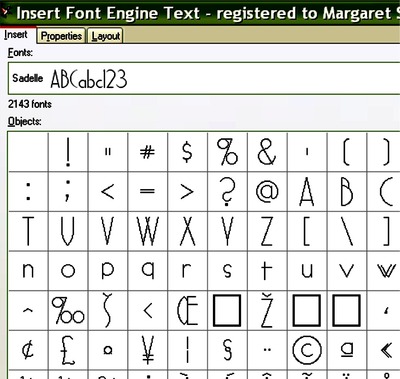
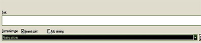
Another way, to not have the connection stitches in the first place, is to go (from Editor) to the bottom of the Insert page (Image 1) and check the box NEAREST POINT for Connection Type (Image 2)
Then from the drop down bar underneath choose Floating Stitches
NOT floating stitches solid.
This should solve your problems.
Sorry, I tried everything to make the bottom image larger but it just won't upload it properly. Hope this helps, hugs n love, Meg
Another way, to not have the connection stitches in the first place, is to go (from Editor) to the bottom of the Insert page (Image 1) and check the box NEAREST POINT for Connection Type (Image 2)
Then from the drop down bar underneath choose Floating Stitches
NOT floating stitches solid.
This should solve your problems.
Sorry, I tried everything to make the bottom image larger but it just won't upload it properly. Hope this helps, hugs n love, Meg
2 comments
Thanks Meg - I did manage to find that for myself yesterday!
Embird is brilliant in having so many ways to achieve the same end result, you just have to find them all. :-)