
109895✽
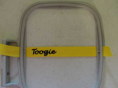
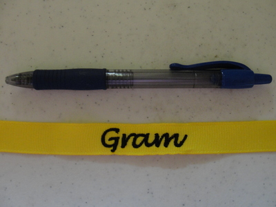
Emb on 5/8 inch ribbon for tags. I used tear-a-way,scrap piece, floated underneath. The font was Apex Emb, Chicago font, size 3/4 inch REDUCED. They are both the same,but took a photo with ink pen so you could judge size. I am not sure if I like my Gram, it looks like it has a 'u' in it. What do you think ? Thursday 07-24-14 I redid the Gram by over-riding the tail of the a. I have not stitched it, but what do you think now. I think it does look a lot better.
3 images:
[1]
[2]
[3]

Comments (14)

243✽
by
oneageswings
21 Jul 2014
+8✽
I agree with you. I saw the picture and didn't know what it said until I read what you wrote. I think I would choose another font. I do think it is a really good idea. Years ago I did the same thing with the last name of a couple that were getting married. I made a set of napkins to use with their china and tied them in a bundle with the ribbon.
1 comment
I know the tag looks like Groum-lol- I did use it on her duck...she doesn't read, so I figure its okay.
16529✽
by
vickiannette
21 Jul 2014
+5✽
yep, not the best M I've seen. Perhaps you could become a Granny like me!!
1 comment
Well 20 some odd years ago I started as Grammamma, but now it is just Gram.

299710✽
well maybe a bit of space would make it more clear? Toogie shows up perfectly! ~hugs~
1 comment
I really didn't want to leave a gap inbetween the a and the m, but I didn't waste it. I do think however, I will stick to the Toogie, it looks good I think.Thanks-T
7590✽
Looks great! I was trying to do some embroidery on ribbon but it's wasn't coming out. Think I needed a better font!
2 comments
I like Apex fonts. They haven't dissapointed me yet. I think this one came in 4 sizes and it was a freebie.
Thanks, I'll check them out.
23293✽
Very nice Toogie! I thought it said Gram till you said it looked like it had a u so then I saw that too. I've not tried this yet, but it's on my bucket list.
1 comment
It's not hard to do, but hoop your ribbon tight... It must be like an optical illusion,lol, look once it's Gram, look twice and I am Groum-lol

145791✽
When I looked at it I only saw Gram, did not see the uformed with the tail of the a 'till you mentioned it. Still think it looks good/Lillian
145791✽
When I looked at it I only saw Gram, did not see the uformed with the tail of the a 'till you mentioned it. Still think it looks good/Lillian
1 comment
Thanks Lillian, I used it on her duck...waste not, want not.

255066✽
Looks great - one of my favourite fonts.
1 comment
Mine too Sarah-thanks
111390✽
Looks very good! Nice work!
1 comment
Thank you

169064✽
I like them both. I can see though where the 'a' joins it can look like a 'u'.
1 comment
I like Toogie but I think I need to move the 'm', where the straight line begins the letter, more on top of the 'a's tail, and it would look better. I just felt funny about putting Toogie on my own g-d's toy, she needed Gram !

234573✽
Well done Toogie and I'm afraid that would irritate me as I see the long tail of the a in it. If it was me I would try another font to see what it looks like. Other than that good work on embroidering on the tape. Love Chris
1 comment
Thanks Chris-read my comment to Karen. I do like this font and it resizes well. Thanks for looking-T

2179✽
by
hagridsmom
23 Jul 2014
+1✽
didn't see the U until I read your comment. I think it looks great - I like Apex designs also. I think moving the m over might take care of it. The Toogie looks darling - very nice font.
1 comment
Thanks I will redo Gram before I stitch again.

51302✽
by
designgirl
23 Jul 2014
+1✽
I like them. I have been wanting to try this but hadn't. I will be now that I see yours.
1 comment
The key to me is finding the right font and right size. Also hoop your ribbon tight.

463490✽
I think I would change the Gram to a font with a better a. Other than that, Great job!
1 comment
Maybe... but don't you think if I move the m to override the a's tail...I am going to try now.I will let you know, if I think it looks better, and then you tell me what you think.