








360672✽
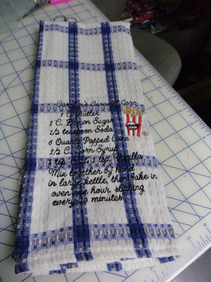
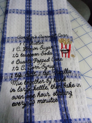
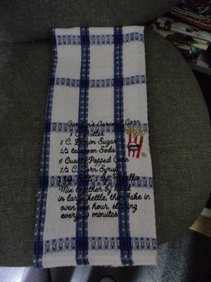
OK i redid this design on a tea towel instead of a towel ,i think you can see it better (well i can) lol
http://www.basketkasedesigns.com/
Thanks for LQQKING!!!Hugs Carolyn
3 images:
[1]
[2]
[3]
Comments (15)

20173✽
by
lindalee757
13 Oct 2014
+10✽
Turned out great Carolyn-definitely easier to read-sorry I misinterpreted you other one-guess the terry loops threw it off- the "t" did get kind of lost on the others-this looks wonderful-now to put the recipe in the "to do" file for one of these days soon. Thanks!
1 comment
your welcome and thank -you:):)hugs

86901✽
by
highlandermom
13 Oct 2014
+10✽
I can see difference. Looks much clearer.
1 comment
Thanks Mary i just had to try right???

145307✽
Now that looks a lot better than the towel and gives a far better impression of Vicky's well-digitised design. Small lettering is easier to read when stitched on less textured material; the loops of towels so often obscure some of the letttering. And that messed-up last line must have been very upsetting for Vicky.
1 comment
oky doky :!!!!

57675✽
This looks much better! I am so glad you redid this. I was afraid with the one on the white towel that your embroidery machine would need to go in the shop.
As always flowers...even if I don't always comment.
As always flowers...even if I don't always comment.
1 comment
Wellllllllll 2 moderators were's the next one lol?????

35301✽
Recipe always sounded good, just easier to read now, thank you for redoing and sharing again. :-) Hugs to u
1 comment
no problem i half to learn to you know:):)
78119✽
That's much better, Carolyn!
Hugs, Lidia
Hugs, Lidia
1 comment
Thanks we live and learn right???

85867✽
Oh Carolyn, It made all the difference. I knew it would because I recently did some lettering on a terry towel and it just sank in even though I used the solvy topping. Kay
1 comment
Katy i never even thought of that ***daaaaaaaaaa big lesson learned lol hugs

72397✽
I love it!! well done
1 comment
Thanks Devon hugs

145791✽
Looks great Carolyn, I'm having no problem reading it, especially when I enlarge it/Lillian
1 comment
lol thanks Lillian hugs

24276✽
This one looks good too :)
1 comment
thanks loosie!!hugs

51302✽

261163✽
by
basketkase
14 Oct 2014
+3✽
So happy you retested this, it looks much better with the tsp instead of the t......thanks for suggesting the change......
1 comment
Your welcome :):)hugs
6097✽
Big difference. I like both but this one is much easier to read. Thanks for posting the redo.
1 comment
your welcome hugs

299709✽
super yummy!~hugs~
1 comment
oh it is and sometimes i double the sauce hehehe
66028✽