Community / Embroidery /
109788
by toogie 17 Dec 2014 ( edited Dec 18'14 13:00 )
+31

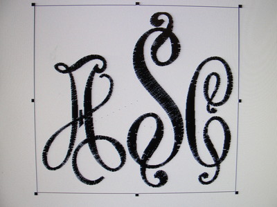
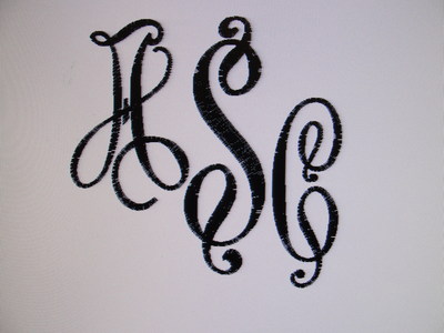
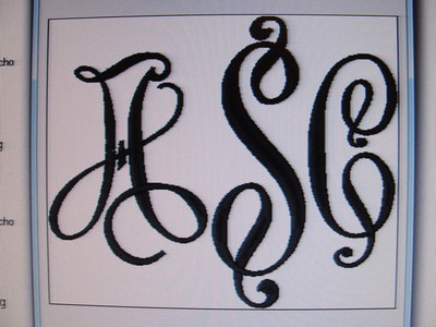
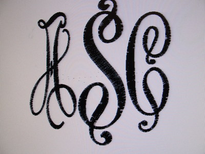
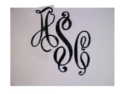
HELP ASAP !-I do hope I have put this in the right section of Community,as I need it seen and answered ASAP- I am making a rain wheelchair poncho for Avery for Christmas. Her mom wants her initals on chest area. I have this font from Apex/Victor 6 in. I had to reduce the A and C so the middle would remain larger. Then I had to reduce the whole ASC to fit in my 5x7, so overall it is now 5.10x6.17 (look at first photo) WHICH IS OKAY.-I showed daughter and she didn't like how the A looked so much bigger than the C. I told her it was probably because the swirls on the C, are only on the top and bottom, whereas the A they are on the width and bottom. I had reduced both the A and C the same percentage.-So on the second photo I reduced only the A, to be the same size as the C, in overall size. It makes the satin stitching narrower, not as bold as the C. What should I do? I like the swirly, boldness of this font and I don't like it not as bold as the others. I don't think I have anything else to use. -Toogie-EDITED 3rd photo is like the first, but the S is moved up as elemausi suggested, so that bottom of letters are even. Do you like this better? I just don't like the satin slimmness of the A in photo 2. Does 3 look evenly lined up ? I have astigmatism, so its hard for me to tell for sure. EDITED photo 4 is with the A up and the C down like Ann suggested. Now I am really undecided, but I do like all much better than reducing the A in #2. EDITED 12/19/14- Thanks to all Cuties for helping me with this project. It came out better than I dreamed it would. I have always loved anything I stitched from Apex, and this font was no exception, even with the resizing the A & C. You can see the finished item in Projects. I made a hooded wheelchair poncho for my grand-daughter. I am very pleased with the pattern too.Merry Christmas to all!-Toogie
4 images:
[1]
[2]
[3]
[4]
Comments (13)
26010
by elemausi 17 Dec 2014
+6
I think the first version looks more evenly, if there is enough place in your hoop, you could take the S higher than the A and the C so the swirls from A and S do not come near by.
4 comments
by toogie 17 Dec 2014
The S is higher. I did not adjust it.
by elemausi 17 Dec 2014
I mean the place of the S should be higher not the S. Use all the same size but the s get a higher place, like a triangle
by toogie 17 Dec 2014
Look at the frame line around the photo. The S touches the top and bottom.
by toogie 17 Dec 2014
Sorry I misunderstood you, elemausi. I have edited and added a third photo for you to see if this looks more eye pleasing. Please advise if this was what you meant.
3385
by KCowden 17 Dec 2014
+5
I think you are worrying for nothing! They both look fine, but if I had to choose, I would choose the first one as well. I love this font!!!
1 comment
by toogie 17 Dec 2014
Trying to please her...I like the first better too and I also love this font, but have never used it. Because of the large size, this is my first opportunity.
318555
by dragonflyer 17 Dec 2014
+6
Well, I like the first picture better, but if your daughter wants the "A" to be the "same size" as the "C"...why can't you just reduce the height of the "A" to make it less tall....leave the width the same...if you do this, the satin stitching should remain about the same thickness...
1 comment
by toogie 17 Dec 2014
I think it is the 'width' of the A that needed adjusting to match the C. The height of the A and C are the same.
35675
by gerryb 17 Dec 2014
+7
I like the first one much better. I'm with KCowden, I don't think it will matter! The stitch out is better in first one, so I'd go with that one!
1 comment
by toogie 17 Dec 2014
I like the first one better too. My husband said I should never have shown my daughter.
16707
by tilde01 17 Dec 2014
+6
Toogie, I too like the first one best. In the second one the A is just too narrow. As someone said, don't change the height of the S, but move it up a little so that the S sits higher and the bottom of all three are at the same level.
1 comment
by toogie 17 Dec 2014
Okay I will move the S up and edit to show you. I misunderstood elemausi.
2834
by annsown 17 Dec 2014
+6
Another way might be to move the original A up and fit the one swirl into the space of the S, and also move the C down...it would then be a bit narrower as a whole, and the A wouldn't look as wide...
2834
by annsown 17 Dec 2014
+6
I like the SC, but would still like you to try moving the A up and fitting it into the space :)
4 comments
by toogie 17 Dec 2014
Look at photo 4. Moved A up and C down,just a bit.
by annsown 17 Dec 2014
Looking better to me...maybe the A could go up some more and over even closer...I traced the A from the computer screen on the back of a receipt that I could see through, and then held it up in "position" to the SC...all just on the screen,..have no idea if it will still fit in your hoop! I'm sure whatever you end up with will be wonderful!
by sewtired 17 Dec 2014
I think I agree with Ann. The problem seems to be the width of the swirl on the A moves if further away from the S than the C is. By moving it up, the swirl can fit closer to the S by nestling in the gap in the S and therefore the letters are more balanced.
by Trish56 17 Dec 2014
Yes this is a beautiful font, I would agree with Ann as well, if you move the A up a little more then across to the S a little it would look like the A belongs, at the moment you still have a little gap there. Once you do that you will see that you have an imaginary diagonal line going from the top of the A then touching the S then the C , they will be then lined up. :)
1941
by Patricia109 17 Dec 2014
+7
How would it look if you moved both the A and the C up so that they are just a smidge higher than the top of the S which would leave the S trailing down below a bit. Then all the swirls would fit well together.
I tried it on paper and it looked ok.
That way it would 'make' the S look bigger too.
Or you could move the B & C down to the same level that the C is in photo number 4 or (again) a smidge lower to fit the swirls to get a distinctive look.
Good luck
1 comment
by Patricia109 17 Dec 2014
distinguished look NOT distinctive -- dah!!
463429
by sewmom 18 Dec 2014
+5
I like picture number 4 the best. Picture number 3 might work if the C is moved to the right just a bit. Agree that #1 A looks too large, I noticed it before I read your comments.
85867
by katydid 18 Dec 2014
+4
Oh sweetie , I don't your software or i would try to help you. Show her what you have and let her pick out what she likes. KAY
4823
by de105 18 Dec 2014
+4
#4 looks the best.
27028
by cherylgauteng 18 Dec 2014
+3
I like #4
122864
by meganne 18 Dec 2014
+1
My preference would be number four but I would go one step further and move the A a little higher and in towards the S so that the loop of the A slots in to the curve of the S
Hope this helps Toogie. hugs n love, Meg
1 comment
by toogie 19 Dec 2014
Thanks Meg, I did the mono like this one. See if you think it came out as good as I think it did. It is in Projects/hooded wheelchair poncho.