

Community / Embroidery /
109788
by toogie 22 Apr 2015 ( edited Apr 24'15 17:51 )
+32

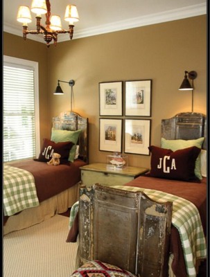
Hi Cuties, I have a question and I hope I can explain what I need to know. I only have a 5x7 hoop so I will have to measure and re-hoop. That's not the problem. I need to know about placement. I am going to stitch 3 letters/monogram MSS, with the S in middle, being somewhat larger. The problem is, the M and the other S that go on each side, are not the same width. If I center the largest S and then put each initial the same distance from it, the M will be closer to the outer edge of fabric/pillow than the other S. Won't it look off set? I also think it would look worse, if I put the larger S more to the right, not quiet centered. What do you do in a case like this? It is to go on a decorator pillow such as seen here.The largest S is 7 in tall x 3.83in wide. The M is 4.75 tall x 4.05 wide. The right or small S is 4.75 tall x 2.62 wide. There is about 1 and 3/8 inch difference in size, between the width of the M and S, the M being wider. I hope you can understand my thinking and please advise me. I need to get this done and have been avoiding it because of my dilemma. Thank you-Toogie
1 images:
[1]
Comments (10)
115778
by asterixsew 22 Apr 2015
+5
Toogie this is beyond me as its bedtime in the UK. I am sure that someone will be along with the answer to your problem and I will read all about it tomorrow morning. On re reading what I have put I would use an applique to do this and not use a embroidery machine and then move the bits of fabric about to get the placing where required then sew it down with a zig zag. Have fun with your project.
3 comments
by toogie 22 Apr 2015
You've most likely gone to bed, but I wanted to say that I have the fonts already and they are not applique. They total about 55,000 stitches and I don't want to mess it up!
by sewgroupie 22 Apr 2015
If I understand your question here's what I would do. Arrange the letters as you want them. Print them as a group to make a stencil. Cut around the design as close as possible. Fold the paper in half to determine the actual center of the three letters and use that as your actual center on your fabric. Do not use the middle letter as your center point. Then the space on the left and right of the monogram should be the same. Clear as mud? Suz
by toogie 22 Apr 2015
I understand what you are saying, I think, but if the large letter is not centered won't it look askew? I thought that may look worse.I don't know.
1821
by CymbleneJones 22 Apr 2015
+6
Toogie, could you try making the m a little narrower & the s a little wider? I have done that with some letters. I guess it depends on the letters & how they look after the narrowing or widening. Just an idea to try.
1 comment
by toogie 23 Apr 2015
Tried that but it didn't look right. The M was too skinny overall, not bold, as the other letters. Thanks though...how ya been? good to hear from you and that you are still here.
4698
by osueo 22 Apr 2015
+6
WOW!!!!!!!!!!!
That is hard---I can do small monograms but you have chosen something I could not do----You are so brave---All the suggestions sound good to me--I wish you luck and hope you will post your pictures when you have completed your projects. God bless you.
2 comments
by toogie 23 Apr 2015
I have done 10 letters, all 4 inch each,with a space in between, with my little 4x4 machine....now watch me mess up this one.
by toogie 23 Apr 2015
scroll up and see I put you a link
3385
by KCowden 23 Apr 2015
+6
Wow, Toggie! I would just go with the centering of the S, then go from there. The M is just naturally wider, so I am like you...I think it would look off with the S not centered.
1 comment
by toogie 23 Apr 2015
I agree that it seems the larger S should be centered, thank you. I will see what others say.
109788
by toogie 23 Apr 2015
+6
osueo, this is the one I was talking about. Click on the link to see. I did this by adding all the widths of each letter and spaces, dividing measurement and started at center, working my way out to each side. I had to be careful not to get mixed up on the spelling!
2 comments
by osueo 23 Apr 2015
That is BEAUTIFUL!!! Your work is BEAUTIFUL. WOW. This is why I love this site. Real people. Real projects. Stuff gets COMPLETED.!!!! God bless you.
by Patricia109 24 Apr 2015
Hey! the letters are almost 100% straight. Well done!
158718
by jrob 23 Apr 2015
+6
This is how I do a job like this. In my program there is an X (north and south) and a Y (east and west) axis. I put the middle letter at 0.00 X axis and 0.00 Y axis. I then put the left letter at 0.00 x axis and see where it falls on the y axis when I'm pleased with the way it looks. For this example lets say it fell at -2.33 Y. I then place the right letter at the 0.00 X axis and at 2.33Y axis. That way the center of each letter is exactly the same distance from the center of the Middle letter. They will not always look the way I envisioned because naturally a M and an S are different widths. Hope this makes sense.
1 comment
by toogie 23 Apr 2015
If I understand this would make my right letter S a little further away from the center letter, than the M. I would have a wider space there. Is that how it would be?
78119
by lidiad 23 Apr 2015
+5
Now I understand why your old 2010 post was up again. hehehe...
Hugs, Lidia
1 comment
by toogie 23 Apr 2015
I left you an explanation there- it seems I am right on your heels- lol
11927
by mrskiki 24 Apr 2015
+3
I think you are over-thinking this. And I agree with getting the design the way you think you like on the computer screen, then printing out a template. Good luck. Hugs. Nan W
8217
by pacmp 24 Apr 2015
+1
OK I will add another option to your mix. I also like things very symmetrical and balanced for them to look ok to my eye, and I am this bad about most things and embroidery and balance in sewing projects bug me the most. So, I would center that center S dead on. Any side to side and to me it would throw off everything. Next I would think if you were putting the letters into a monogram crest, then I would measure so that both the smaller letters were the same distance from that crest edge and then vary the space between the large S and the start of the 2 smaller letters, but since you are not putting a crest around the letters and as long as you are not having a material that would create a border effect around those letters, then I would space them exactly the same distance from the large S and then to help make the distance to the outer edge of the pillow not be as noticeable then I would try to make the pillow large enough that there would at least be several inches before the seam, the more the better. It is expected that the letters M and W take up more space and the key is to look where the balance would be most obvious, first being the center of the design, then if there was a border like a crest or some type of border that letters would come close to and then finally looking at the balance between the letters. If the pillow size is so small as to create a border effect where that would draw so much of your attention then I would go back to placing the 2 smaller letters the same space away from the seam and again vary the distance between the large S. I also should say that as this is a gift and will not be in your own home you likely are worrying a bit too much as it will be loved no matter how you placed the letters. If nothing seems to sound right to you, or look right to your minds eye then maybe change things and put the letters at an angle corner to corner, top left, down to lower right with the Large S again centered, which would be so different and unexpected it may well change how you feel about the letter placement. I am sure that however you decide to make this pillow it will be well appreciated. You will figure out a way to make it look perfect! Pam
158718
by jrob 24 Apr 2015
+1
Toogie, I set this up to look at it. I left the middle S the same as your measurements. I changed the M to 3.50 wide x 4.75 tall, and I changed the S to 4.75 tall x 3.00 wide. The Y axis on all are 0. The small M X asis is -4.39 and the Small S Axis is 4.10. It's never going to look like the perfection you have envisioned because of the difference in the letter sizes. Hope this helps you.